Friday, 29 October 2010

Charles Eames and I


One of the conditions that made me who I am today is that as a child, I had very simple playthings. I didn't grow up with toys that were computerized and in fact I didn't have many toys that were mechanical. And so I had the great advantage in life of having to use my imagination. I treasured what toys I had, safeguarded them, and still have quite a few of them with me today. Many of them are classics. The toy above is sold as Charles Eames' House of Cards, and it's the same set I used to construct buildings more than 50 years ago.

Charles Eames was trained as an architect, but he was really a renaissance man. He was responsible for popularizing molded plywood furniture, and in particular for the Eames Chair, which became the status symbol of many a CEO. If you've ever been to an event where chairs have been unstacked, it's likely that their design originated with Charles Eames.


Though he had a thriving livelihood manufacturing chairs, Charles Eames (and his talented wife and partner, Ray) moved in many arenas. He produced films and animations, and he was a master of conveying extremely complex ideas very simply and elegantly.

When I was in college, I had the great opportunity to go to a lecture by Charles Eames. I remember on that particular evening I had another commitment, and I agonized over which to attend. I'm so thankful I made the right decision.

Eames spent the evening sharing his films and slide shows, and talking about them. To fully appreciate that, one has to know that Eames developed the multimedia presentation. He was a master of making multiple slide presentations or movie projections move in sync, and each individual spotlight of movement would be exquisitely beautiful. It's not surprising, therefore, that President Eisenhower asked Eames to produce the very first cultural exchange between the United States and the Soviet Union. Eames made a multimedia presentation about an average day in the life of America, and it was projected inside a geodesic dome constructed by Buckminster Fuller. The evening I heard him, Eames showed that same presentation and talked about it, and it was very powerful.

Glimpses of the U.S.A., Moscow, 1959  |  The Work of Charles and Ray Eames  |  A. Abrams  |  1997

His idea was to show, in multiple projections, ordinary aspects of one American day as it happened all across the country. So imagine sitting in the audience and seeing, simultaneously, the sun rising above New England, above cities, wheat fields, national landmarks — the sun rising above about a dozen disparate places that are all quintessentially American and breathtakingly beautiful. Then imagine just a split-second later seeing breakfast being prepared and served across the country, and it, too, is a simultaneous profusion of images that are beautiful and stunning. Stunning! And all twenty-two hundred images projected in a rhythm that's like a great dance across the screens. What I remember of the evening is that everyone in the audience (it was a packed concert hall) gasped in unison, and gasped again and again. Charles Eames had such a talent for presenting beauty that it literally took the breathe away.

The very end of the film showed forget-me-nots in every conceivable way — clutched in hands, in rock crystal vases, in rock gardens... When the lights came on, Eames recounted that he had not known it, but the meaning of the forget-me-not is the very same in Russian. Russian audiences cried as they watched the multimedia event, and I'm sure it had meaning to them on many levels. The sheer beauty of his work was such that I still feel an emotional tug just recounting that evening and what an impact Eames has had on me.

For anyone reading this who is a student, I will share one thing that Eames said that evening that has always stayed with me and resonated. He said that he believed anyone in the process of attaining a master's degree or doctorate should receive it only after they could successfully explain their thesis to a second grader.

Ray and Charles Eames went on to become designers of exhibitions, all the while building handsome furniture and making movies.

I go back now and look at the individual cards of the Eames toy, and I appreciate how in such simple images Mr. Eames imparted rich color, beauty in the everyday, beauty in order, the charm of things grouped, and all those things that would lead one to become a designer and a designer of one's life. He's still an inspiration.

Monday's posting will be a look at Charles Eames' office.

Wednesday, 27 October 2010

A Very Different Oreo


I am a collector of antique photography and gutta percha cases. One of the more interesting gutta perchas in my collection is one that dealers call, for obvious reasons, an Oreo. When this Oreo is taken apart (you like to take them apart, don't you?), it reveals a locket-like tintype.


Gutta percha is a natural rubber from the Malaysian gutta percha plant, seen below, and that natural rubber was used for a number of applications. According to the George Eastman House, however, the gutta percha case was nothing of the sort. It was actually an early shellac-based plastic dating to 1854.


Monday, 25 October 2010

Greek Keys No. 2

My welcome mat is out,
and I'm ready to share some more Greek keys!

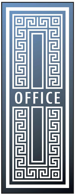
I was looking through a recent style magazine that had an ad for a British salvage company. There was a photo of a marvelous etched glass door in the ad, but it was more than half obscured by other salvage! To spare you my own disappointment, I've reconstructed the design, free from the distraction of all the other salvage. Don't you love the scale of the key?


This ceiling by Robert Adam graces the library of Harewood, home of the Lascelles family. King George V's daughter, The Princess Royal, married the 6th Earl of Harewood in 1922, which makes the current owner of this fine Greek key a cousin of Queen Elizabeth II.

 Where better to look for Greek keys than on a Greek vase?

I have several excellent books by John Boardman on Athenian figure vases of the Classical period. What I have discovered as I delve into Classical art, is that there are many, many variations of Greek keys. But when these stunning vases were at their height, these three key designs predominated.

My entire series of Greek key designs can be found on my side bar — just look for the brown stele.

Sunday, 24 October 2010

Unique Awards


My favorite charity in St. Petersburg is the St. Petersburg Free Clinic. For 40 years, it's been helping those in need by giving temporary assistance of food, shelter, medical care, limited financial assistance and referral information.

Jane Egbert, the clinic's very creative administrator, came up with the idea of giving yearly awards in the form of soup cans. I designed the award shown above, which gets updated every year. It's especially appropriate for the clinic, and it always seems to delight the recipients.

Thursday, 21 October 2010

Illustrator Ivan Bilibin


Ivan Bilibin (1876-1942) was a leading Russian illustrator and graphic designer of the early 20th century. His style evoked Russian folk art, and iconic and medieval art. His illustrations for Russian fairy tales brought him early recognition.

This is the back cover illustration for Alexander Pushkin's The Tale of the Golden Cockerel. Later, Bilibin would design stage sets for the play of the same name.

I think this detail of an illustrated czarina is interesting for its resemblance to Czarina Alexandra. The next three illustrations show Ivan Bilibin's evolution in style from 1906 to 1941.

You'll get a better feel for Bilibin's work if you click on the three images above.
The bottom two show his detail particularly well.

One can see from these images, and all of Bilibin's work, that he was a tremendous researcher. He traveled throughout Russia sketching, and he researched details in museums. Bilibin became a stage and costume designer, and his costume designs, like the 1929 Prince Igor, below, are beautifully finished illustrations.


Ivan Bilibin was a strong graphic designer who had many logos and bookplates to his credit. I'd like to call one little detail to your attention. If you click on Les Amis de L'art and see the slightly larger version, you'll notice that the double line below the lettering is ever-so-slightly bowed. It's an elegant touch and reveals that Bilibin didn't use mechanical tools slavishly. In fact, I believe the other lines in this logo are "drawn."


Bilibin's style was established early and was popular enough that he had a number of imitators. He was especially concerned that his own work not become formulaic. In later years, he tended to greater realism. The image below, while not a commercial piece, nonetheless shows the direction of Bilibin's later book illustrations.


Late in life, Bilibin taught at the Leningrad Institute of Painting, Sculpture and Architecture. All these illustrations come from two excellent books, Ivan Bilibin, Harry N. Abrams, and a reprint of The Tale of the Golden Cockerel, Thomas Y. Crowell Company.

Tuesday, 19 October 2010

Castles of the Old Northeast


One of the older neighborhoods in St. Petersburg, Florida is the Old Northeast.
It has a mixture of architectural styles, including Mediterranean Revival. Below are nine of my favorite houses, which I like to call "Spanish Castles." They are all in approximately a six-block radius.

Monday, 18 October 2010

Signage for Monday


The beach communities of St. Petersburg, Florida have buses that look like trolleys. The line is called Suncoast Trolley, and this is their signage (a smaller vertical sign underneath says "Suncoast Trolley"). Wouldn't it be nice if more signage were as elegantly simple?


Then I've always enjoyed this sign from my brother's neighborhood. The truth is elegant in its own way.

Friday, 15 October 2010

John Wanamaker


At the very beginning of my career, I worked for a company that designed gift catalogs for John Wanamaker, the fashionable Philadelphia department store. The store's logo is based on John Wanamaker's actual signature, and it intrigued me. Like the rest of his handwriting, the signature letters form straight lines of ascending and descending steps. This was certainly an unusual personality, so much so that I was inspired to learn more about graphology, and about John Wanamaker, the man.

An analysis of Wanamaker's handwriting reveals a highly creative person who was of a naturally hopeful and buoyant disposition, coupled with caution, doubt and self-control. In other words, the pragmatic optimist. This was indeed the personality who came to be known as the "Father of Modern Advertising."

Wanamaker (1838-1922) was blessed with the ability to see opportunity in the worst of situations, and so it must have seemed that he had the Midas touch. He started a clothing store with his brother-in-law in 1861, at the beginning of the Civil War. That was the absolute worst time to start a clothing business because the cotton industry was, of course, in a state of shambles. In those days all clothing was tailored to the individual, and during the war many tailors were left with unclaimed orders. John Wanamaker regularly traveled from Philadelphia to New York to buy, at low cost, such seemingly bad debts. These he then turned around and sold in his own store as the first off-the-rack clothing.

As many tailors failed, Wanamaker's business flourished. A great part of his success was the Wanamaker philosophy of a firm price, with satisfaction guaranteed or money back. We might take such policies for granted now, but in that time, most stores didn't have fixed prices, and haggling was the rule of the day.


John Wanamaker also regularly plowed a good portion of his profit back into advertising, and it was he who was responsible for the first full-page newspaper ad. To that innovation he also contributed an appreciation for advertising white space, which undoubtedly had a profound impact upon a public used to small headlines and lots of fine print.

Wanamaker was a visionary so far ahead of his time that he foresaw shopping malls before department stores were even popular! In fact it was because other merchants could not bring themselves to join in the mall vision that Wanamaker instead developed the first modern department store. Others had been built before, but Wanamaker's was the first as we know department stores today, with individual managers and specialized sales personnel.

Fifteen years after his original 30' x 80' store, Wanamaker built the Grand Depot, the country's largest store. On opening day, 70,000 people attended, including President and Mrs. Grant. The Grand Depot was the first department store to use electric lights, pneumatic tubes, and a ventilation fan system.

From my advertising collection, trade cards of Wanamaker's first store, and of the Grand Depot
No matter how successful he became, Wanamaker continued to walk the aisles of his store, often slipping behind the counter to assist in a sale. He also continued to think up progressive advertising schemes, which led to $2.98-type pricing, the first white sale, and ultimately, department store history's first million-dollar sales day. Anyone who says, "The customer is always right!" is quoting and paying tribute to our premier advertiser.

John Wanamaker became Postmaster General in 1889 and in that capacity founded Rural Free Delivery. That in turn paved the way for other success stories, notably that of Montgomery Ward and Sears, Roebuck.

The front and back of a well-worn Wanamaker prime
In the age of "robber barons," Wanamaker was a notable exception. He took a personal interest in the welfare of his employees and their families, he took an active role in education, and he was this country's first secretary of the YMCA.


A spring fashion catalog cover I designed for John Wanamaker

Tuesday, 12 October 2010

Ancient Urban Planning


Several years ago, my nephew and I visited the center of the Anasazi culture in Chaco Canyon, New Mexico. The Anasazi were the ancestors of the Hopi and Navajo, and their name means "ancient ones." From 800-1200 A.D., the Anasazi built a most remarkable city that has the mark of modern urban planning.

Original painting by L. Kenneth Townsend for Reader's Digest

There are a number of building sites in Chaco Canyon, but the primary one is a D-shaped structure known as Pueblo Bonito. Pueblo Bonito was discovered by a U. S. Army expedition in 1849, and was excavated from the 1870s into the 20th century. Above is an 1880s archeologist and an aerial view of Pueblo Bonito today. The two bottom images show the site as it would have appeared in Anasazi times.

Pueblo Bonito contained more than 600 rooms and 40 kivas (round ceremonial chambers). The Anasazi transported thousands of trees many miles for timber, they devised a sophisticated watering system, built raised plazas for ceremony and established approximately 400 miles of roads. Some roads were 30 feet wide and in straight segments for 40 miles.

The Great Kiva — this is a community center the size of a small stadium.
The Anasazi were great masons. These bricks may appear to be adobe, but they are all cut stone. Archeologists date different building periods by the evolving masonry styles. The bottom right example is the late period, the mid-1100s A.D.


My favorite photo from the trip. I call it "Inner Sanctum."


Holes for rafters indicate that the canyon face was used as a back wall for apartments.
From 1921 to 1927, Neil Judd headed an archeological excavation funded by the National Geographic Society. One of his interesting discoveries was that the burial grounds were not big enough to reflect the huge population that would have inhabited Pueblo Bonito. Judd concluded that the center was not fully inhabited year round, and that there were seasonal influxes of distant tribes for ceremonies.

Those photographs not my own were taken by George H. H. Huey
and are courtesy of the Western National Parks Association.