Friday, 10 September 2010

Asher Brown Durand


Asher Brown Durand (1796-1886) is remembered today primarily for his beautiful paintings of nature. He painted richly detailed views of the Catskills and Adirondacks, and New Hampshire's White Mountains. Durand's work exemplifies the Hudson River School of art.


This painting. Kindred Spirits, is Durand's most famous work. According to Wikipedia, it's valued today at over $30,000,000. It's a tribute to Durand's friend, the painter Thomas Cole, seen talking with the poet William Cullen Bryant.


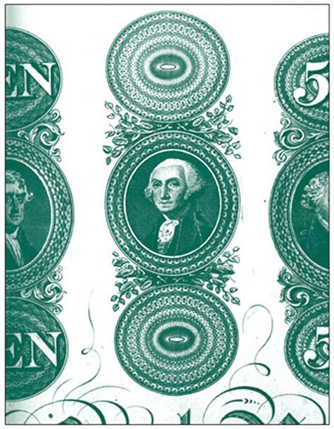
Not many people who admire Kindred Spirits know that painting was Asher B. Durand's second occupation. Durand, the son of a silversmith, started out as a banknote engraver. It is Durand's distinctive style that has defined the look of United States currency from his time right up to the present. The image above, from the Metropolitan Museum of Art. is one of Durand's sample engravings.


I've always had a soft spot in my heart for Asher B. Durand, the engraver. That's because, as Milton Glaser would say, banknote engraving is part of my "visual vocabulary." As a commercial artist, I've drawn money so many times, it's a wonder I didn't just join the Bureau of Printing and Engraving! I created the pen and ink drawing above for Elcotel, a company that manufactures pay phones.

Wednesday, 8 September 2010

George Washington's Left Eye


 I recently finished a painting that includes a portrait of George Washington.


In order to achieve his likeness convincingly, I assembled three portraits by Gilbert Stuart, and studied and compared them. What I found interesting is how different they appear, and yet how similarly they were painted.

These three portraits by Stuart are each recognizable as George Washington, and yet they feel distinctly different. It’s as though they each reveal a subtly different personality trait in Washington, or at least a different mood.

In studying these images, one has to appreciate that Stuart made his living by painting portraits, and that while Washington's portrait was in high demand, the president had posed only twice for Stuart. Therefore Stuart was busily making copies of his own copies. There was no Washington sitting in front of him and of course, nothing like photographic reference. His own work was the primary reference.


Now compare these eyes from the three portraits. They’re all Washington’s left eye, the right eye as we face the portrait. One can see, especially in the first two eyes, that Stuart was trying to duplicate the likeness, stroke by stroke.


In this image, I’ve superimposed all three faces. While the noses are slightly off-register, the eyes align perfectly. I conclude that Gilbert Stuart used some method of tracing his copies, and I think that the varying moods of Washington’s portraits were never a primary intention. Instead, I think Stuart was focused on simply trying to duplicate, for the umpteenth time, an accurate likeness.

Sunday, 5 September 2010

Hermann Zapf


Herman Zapf (1918-2005) ranks as one of the great typographers of the 20th century. It's a good bet that the computer at which you're now sitting came already loaded with the fonts above, just a few of his many designs.


Zapf designed Melior in 1952. He was intrigued with the shape of the 50's television screen and based the Melior "O" on that form. It's interesting to note that type designers often start their work with the "o," which then becomes the template for many lower case letters.


Most Americans want to pronounce "Zapf" like "half," but the name rhymes more closely with "cough." I had the honor of taking a class with Zapf when I was in college in Pittsburgh, and my lasting impression of him was that he was an exceptionally elegant man. He wore crisp white shirts with French cuffs, and his cuff links were made from gold Roman coins. 


Some time ago I designed a logo for the Konglomerati Foundation, a literary center that was dedicated in part to the preservation of letterpress printing. I asked myself, "What would Hermann Zapf do?" (WWHZD), and this is what I came up with. The logo's shape is the interior of the Melior "O."

Thursday, 2 September 2010

Ephemera - Huyler's Cocoa

In my last post I mentioned chocolate and cocoa beans, so I'll stay on that subject to make a nice segue into the world of ephemera. I collect ephemera, which Wikipedia defines as, "... transitory written and printed material not intended to be retained or preserved. The word derives from the Greek, meaning things lasting no more than a day." Good examples of ephemera might include concert tickets, cigar bands and menus. The ephemera that I collect is primarily advertising from the late 19th century.

This is a paper die cut of a tin can. It's also known as a trade card. Trade cards were usually distributed by merchandisers at the point of purchase, and they were popular from the 1870s through the mid-1890s. They were little premiums that served both as advertising and as the fodder for Victorian scrapbooks. Because they were lithographed (as opposed to being printed in the modern 4-color process), trade cards were exceptionally bright and colorful. That's because, for example, an orange detail would be an printed with pure orange ink, rather than halftone screens of yellow and red.


I also collect antique tins (now to a lesser extent than I used to), so it was a real thrill to find this Huyler's can and to reunite it with its paper relative. Both the paper die cut and the tin were lithographed.

Tuesday, 31 August 2010

Schakolad Pier


Today, an architectural confection for you! Chelsey Cash of Schakolad has created a chocolate replica of the St. Petersburg Pier. This is actually a tribute to the 36-year-old landmark, which is soon to be replaced by a newer pier. Chelsey's masterpiece will be on view at Schakolad through September, after which I'll be volunteering at my favorite chocolate company (to help dispose of the pier).

Chelsey's effort merits the 5-Cocoa Bean Award.


Sunday, 29 August 2010

Architectural Influences

I mentioned in my last post that my grandfather was an influence in my love of things classical. I would be remiss if I didn't also mention the influence of my father, who was an architect by training, though not by profession.


One of my father's professors required students to turn in weekly index cards of different architectural styles. The top image is a 5" x 3.5" rendering of the Louvre. The bottom image is a detail of the center of the sketch, and measures approximately .75". This is the only such card of his that I have – I would dearly love to have seen the whole set!

Friday, 27 August 2010

Finials and Urns


I have a thing for finials and urns, and sometimes I hit the jackpot and find both in the same object. I found this wooden finial recently at a St. Petersburg antique shop. The carved flame and wreath base made it a must-have. Incidentally, the correct description of the grooves, as they would apply to columns, is "serpentine fluting."


The base has one corner that needs to be repaired. It looks as though there might have been a struggle to pry it from its last home, but how fortunate that there was no further damage.


How is it that some of us are so drawn to certain iconic shapes and objects? Is it due to genes, past lives at Versailles, teachers, our environment? I have no doubt that part of my attraction for things classical is because – when I was just out of toddlerhood – I spent many hours following my grandfather as he methodically documented Washington, D. C.'s National Gallery. He used a Zeiss Ikon, always shot in black and white, and always printed on a heavy matte paper. Like the one above, his images were rich in contrast and all these years later, still wonderful to study. This is a detail of an ornamental urn by the French sculptor Claude Michel, known as Clodion. It was carved in 1785.