Showing posts with label ephemera. Show all posts

Tuesday, 16 December 2014

Wishing You Happy Holidays!

In my last posting, I unveiled a dove to complete part of my Pompeian mural. And today I'm offering you this dove from my collection of ephemera. The red ribbon in the dove's beak reads, "May joy be around you." That's my wish for your holiday season and for the year to come. Thanks to all my blogging friends, and all the best in 2015!

.

Thursday, 13 February 2014

19th Century Cigar Labels

As my regular readers know, I collect antique advertising, mostly in the form of lithographed trade cards, which you can read about in my sidebar, or here. I don't go out of my way to collect cigar labels because I don't want to stray too far from my field of collecting. But every so often I come across early cigar labels, those that were lithographed on plain rag paper like the rest of the collection. I'd like to share a few from my collection, and I estimate that these are all approximately 135 year old.
This label and the following one both emphasize the important commercial aspect of the cigar industry in the 19th century. Cigars were of course a major Cuban export, after sugar. In the United States, cigars held a special function for all the industrial shipping that moved south by river. When those vessels were emptied, they were often laden with cigars for the trip back north.

Mercury is the Roman god of commerce, so he is honored here with his own "El Comercio" brand. (I'll have to add that Greek key to my sidebar page on Greek keys!) This Mercury is a little portly, and his helmet appears to be a golden Homburg.

Lithography was a new color printing process in the 1800s, and the influx of rich colored images caused many people to save labels of all sorts, sometimes for scrapbooking and sometimes to adorn their walls. This colorful image was carefully cut out from a bigger label. (We should have known that the gods of tobacco rode in on a dragon.)

I've featured this American beauty before, but it's such a rich example of early lithography that I'll show it again. It's only about two inches high.

I've scanned this Cuban label which was actually lithographed in Germany. Unfortunately, scans absolutely deaden items that are gilded, so I also took a digital image of this spectacular piece of paper, below.


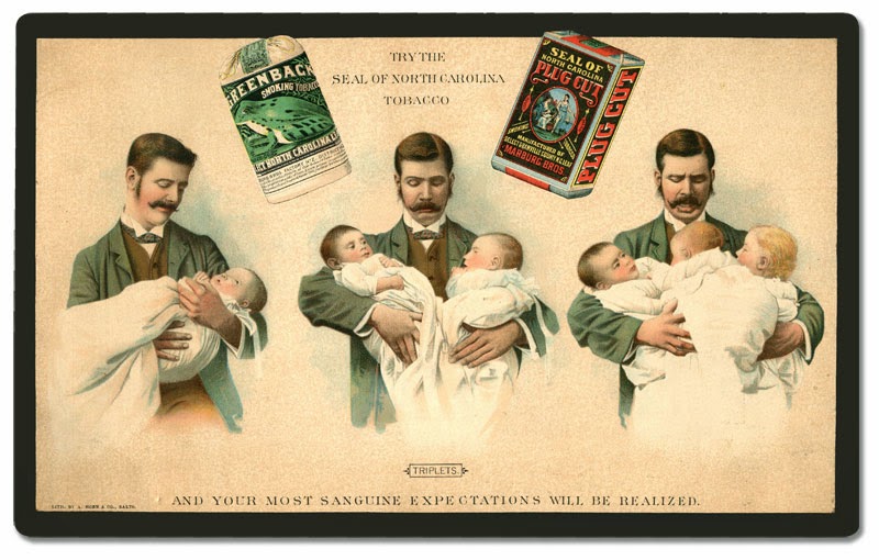
I'm adding the image below, which may or may not be a cigar label. Nonetheless, it's Victorian graphic design at its best, and a message good for today and tomorrow!


Have a Great Day!

.

Wednesday, 8 January 2014

Victorian Calling Cards

Mark D. Ruffner
The Victorians enjoyed colorful calling cards! If you visit my page on Trade Cards and the Emergence of Corporate Identity (on the side bar, or here), you'll see that the Victorians delighted in the new process of chromolithography.

Generic lithographed images  — with spaces left blank for overprinting — were used for everything from ads to school rewards. The following five calling cards from my ephemera collection fall into that category.

Mark D. Ruffner   

Mark D. Ruffner   

Mark D. Ruffner   

Mark D. Ruffner   

Mark D. Ruffner   
 The image of this last card is highly embossed.

Mark D. Ruffner   

Some Victorian calling cards had patterned backgrounds, like the four following ones. I think of the one directly below as being a Gothic pattern, though I think it's actually supposed to be lace.

Mark D. Ruffner   
Mark D. Ruffner   
Mark D. Ruffner   
Mark D. Ruffner   

One of the things that makes these patterned calling cards appealing is that the pattern is repeated on the back side.
 
Mark D. Ruffner   


Mark D. Ruffner   
My favorite Victorian calling card (and a favorite of the entire ephemera collection) is Joshua B. Gayman's hand stenciled card.

Most of these cards are the size of a modern business card. Joshua's is a little smaller, approximately 2¾" x 1½".

The stencil Joshua Gayman used would have been a paper-thin piece of copper — like the one below — and it's easy to imagine that he used it on many items besides calling cards.

mamaisonfrancaise  |  etsy
.

Wednesday, 1 January 2014

Happy New Year!

from my collection of ephemera
Dear Blogging Friends,
I wish you a happy, healthy and prosperous
2014!

Friday, 4 October 2013

Amusing Advertising for Greenback Tobacco

As I have mentioned before, it's ironic that I've never smoked, for my ephemera collection is heavy with good tobacco advertising of the 19th century.

click to enlarge
In my side bar page on antique trade cards, I note that 19th century advertising often had imagery that had little or nothing to do with the product being sold. The charming card above, which measures 12¼" x 7½", is a prime example.

For my own collecting purposes — which are very much rooted in an interest of graphic history — I like that the card beautifully illustrates the tobacco's packaging.

While the plug cut is wrapped in paper, you can see that the Greenback tobacco is a cloth bag with a draw string, surrounded by a paper label and seal. The paper around the Greenback would have been discarded immediately, so I would surmise that if any labels are still in existence, they'd be mint and unused.

The quality of the artwork and lithography is very fine. While Marburg Brothers was obviously in North Carolina, the advertising was done by Hoen & Co. of Baltimore, Maryland. If you click on the link, you'll see that the lithography was probably the most advanced of its time.

click to enlarge
.

Friday, 19 July 2013

Victorian Hand Analysis


This card, dating to 1893, was designed by Barbour's in-house art department.  I'm guessing that the artist who designed it consulted Owen Jones' The Grammar of Ornament. And the back of the card is as interesting as the front. So let's proceed to the hand analysis.


(As the newspaper's horoscope always disclaims, this is just for entertainment — I know you're not really an indolent tyrant.)


Oh, oh! I'm not doing well!


 Well, I'm in trouble, but I hope you did better!
 •  •  •
Going back to the beginning of this posting, many 19th-century graphic designers consulted newly published handbooks of historic ornament. The designer of the Barbours card may have used L'Ornement Polychrome, by Auguste Racinet. Here are several samples from that book:

.

Monday, 1 July 2013

Decorative Victorian Typography


click to enlarge
As I've been sharing my collection of antique advertising with you, I've usually concentrated on the fronts of trade cards, which are often beautiful examples of 19th century lithography.

But the backs are sometimes just as spectacular in their decoration and lettering. They're also very imaginative in their design. Look, for example, at the "L" in "Liverpool!"

You'll notice that all of the examples I share in this posting have curved lettering and some degree of bannering.

This example comes from a very small card, only about two inches high. It's greatly enlarged for your viewing.


One final observation that I'd make is that almost all of the typography shown here (if indeed not all of it) is hand-lettered. Just one more reason that I enjoy collecting and studying these little marvels!
.