Saturday, 26 April 2014

Pompeii No.9: Making the Entablature

This week I'm focusing on the structure that connects my columns, creating an entablature for the Pompeii Room.

Mark D. Ruffner
It's really easier to explain an entablature by showing you a diagram. The cornice is the topmost moulding, which can be quite elaborate. Cornice is also the word used for the moulding — inside one's house — that runs around the top of a wall, right below the ceiling. The frieze is directly under the cornice and takes up the greater part of the entablature. It's the surface that is often used for incised inscriptions. And finally, the architrave is a base moulding, and the space beneath it.

en.wikipedia.org
Many classical buildings, like the full-scale Parthenon in Nashville, Tennessee, have an entablature with an architrave almost equal to the frieze.

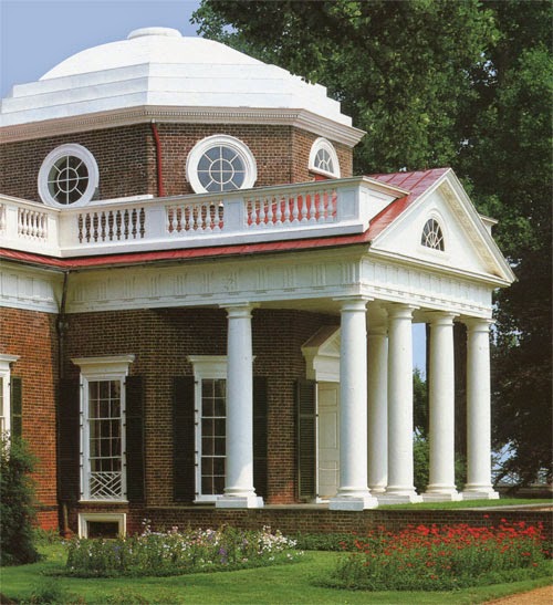
Jefferson's Monticello  |  photograph by Langdon Clay  |  Abbeville Press
My own preference is for a more generous frieze and a reduced architrave, as Thomas Jefferson used for his home, Monticello.

I suppose one could dispute whether my two top mouldings actually constitute a true cornice, but the proportions of my entablature are in keeping with many classical buildings.

This part of the project looks deceptively simple, but it took a lot of measuring, taping and retaping.

Notice the vertical shadow I've added to the entablature, as though the entablature is slightly behind the masonry.

Next week I'll be decorating the frieze. I haven't settled yet on any particular form of decoration, so I'm having fun looking through books on Pompeii for inspiration.

Check by next week!
.

Saturday, 19 April 2014

Pompeii No.8: The Cobalt Door Surrounds


This week I'm painting two inset panels on either side of my hallway portal. I've looked at the space for years, thinking that it was a prime spot to make an interesting statement. I thought alternately of painted figures or three-dimensional totems. Ultimately, I chose the two panels that are featured in the painting below.

click to enlarge | The Art of the Italian Renaissance | Ullmann
This is a c. 1480 portrait by Melozza de Forlì of Francesco della Rovere, also known as Pope Sixtus IV. Sixtus is shown with his librarian and four nephews. It's appropriate that Sixtus IV is immortalized with the nephews because he was known for nepotism and, in fact, he made six of his nephews cardinals! Indeed, it is no coincidence that the word "nepotism" is derived from the Italian word for nephew, nipote. While the subject of this lovely painting established the Sistine Chapel, he was corrupt, and history remembers him unkindly.

Though he was a fine artist, little is known of de Forlì, in large part because he was overshadowed by the next generation of Italian artists, which included Michelangelo. We do know that de Forlì worked for Sixtus IV, and that he was responsible for the frescoes in the Vatican library.

click to enlarge   |   sources below
In the image above,
the center decoration is by Benozzo Gozzoli,
Benozzo Gozzoli  |  Scala/Riverside

The first and third pilasters are by
Filippino Lippi and Pinturicchio respectively,
Italian Frescoes  |  Abbeville Press

In my research, I've discovered a number of Renaissance frescoes that utilize cobalt blue pilaster decorations.

While the Egyptians were known to have developed a synthetic cobalt blue, the formula was lost to later cultures, who ground lapis lazuli to create the rich color. And so it is no wonder that Renaissance artists would concentrate the expensive color in a prominent yet narrow part of a fresco.

My approach to decorative art such as this mural — or the Egyptian door I shared earlier — is usually through draftsmanship. I like to carefully work out everything in advance, sometimes making multiple tracings. I then transfer a design by burnishing it from the tracing.

That way, as you can see, I have a record of my designs, should I need to refer back to them or reuse them.


click to enlarge
The finished doorway.

click to enlarge
Now I'm going to put away the masonry tools for a while and get back to that beam that unites all my columns. Next week we'll be adding a little dimension there to transform it into an entablature.
.

Saturday, 12 April 2014

Pompeii No.7: Painting Hallway Masonry

Mark D. Ruffner


This week I'm concentrating on painting the masonry that will surround the doorway to my hall.

Originally, I had contemplated stonework that was aged and maybe even a little decayed, but in the end, I didn't want an element that would contrast with the freshness of the rest of the mural. Anyway, my Pompeii is not the one of ruins!

I realized, however, that the actual texture of the wall could be used to advantage, to create a rich, subtle underpainting of stone (limestone, perhaps). I started by putting light washes of earth tones on the wall. Then I rubbed away selected areas with a scouring pad.

Once that was done, I redrew the lines representing cracks, and repeated the process numerous times. While all this scrubbing created a pretty nifty stone texture, the look at this stage was not in keeping with the rest of the mural. Not to worry; I added several light washes to approximate limestone.

In making the stonework lighter, one of my goals was to make the stone and columns close in color value. Because the design is going to become increasingly more complex, it will be all the more important for each element to complement the next one.

The finished, more subtle result can be seen below.

Then it became a matter of adding the cracks, with their shadows and highlights. I did this several times. On my first try, I played around with chips and all sorts of unevenness in the lines (like the first photograph of this posting). I quickly discovered that the more regular I made my blocks, the more convincing they were. So most of my irregularities are small ones, at the corners of the blocks.

I'm not showing you the whole doorway surround for a good reason. Next week I'll be painting a panel on either side of the doorway, as though they're inset. They aren't Pompeian panels, but they'll complement the Pompeian design.

No, these are decorations that a man named Francesco della Rovere would have recognized.
.

Saturday, 5 April 2014

Pompeii No.6: Painting the Ionic Capitals

Historic Ornament: A Pictorial Archive   |   C. B. Griesbach   |   Dover
In last week's posting, I painted columns (pilasters, actually) in the Pompeii Room, and now it's time to crown them with capitals.

One of my great pleasures in the process of painting this room is in looking through many art reference books and choosing the elements for the room as though I were actually building a house. And how delightful to know that whatever I do end up choosing will be in stock, as long as I can paint it!

I chose the Ionic capital (above) for an interesting reason. My first choice would have been a Corinthian capital, like the one below:

Historic Ornament: A Pictorial Archive   |   C. B. Griesbach   |   Dover
You can see, however, that the classic Corinthian capital is twice as deep as the Ionic one. As I did my visual calculations, I quickly realized that because the columns don't go all the way to the floor, and are in fact short, the preferred capital would make them appear downright squat. And that would never do!

There are six capitals to be painted, and several shades of auburn and mauve to be mixed, so my approach is to paint all six capitals simultaneously. As I paint one element of a capital, say that highlighted line that goes through the middle, I paint the same highlight on all of them.

That way, all six capitals look like this, with very little variation.

click to enlarge
Here's the Pompeii Room as it appears today.

On the left you can see a block of yellow, which was the original color of the room. In my next posting, we'll turn that into masonry, working our way around the hallway door.
.

Saturday, 29 March 2014

Pompeii No.5: Painting the Columns

This week I'm painting the columns of the Pompeii Room. My versions are squared and would have four or maybe three sides in reality, so they would more properly be called pilasters.

The Metropolitan Museum of Art Bulletin, Spring 2010   |   www.findamuralist.com
The Pompeians often decorated with an unusual form of column that had, for lack of a better way to describe them, square plugs. I've been looking for the origin and meaning of such columns, and have yet to discover any information that would help to illuminate. Perhaps one of my clever readers can fill in the blanks. At any rate, I've looked at this element and decided that adding it to my own room would lend a distinctly Pompeian air.

On the left is a fragment from the villa of Publius Fannius Synistor (it can be viewed at the Metropolitan Museum of Art), and on the right is a fragment of the South Porch of the Getty Museum in Los Angeles. It's the work of the brilliant muralist, Garth Benton.

Some of the folks who have seen the room at this early stage are interpreting the auburn color as a brown, but it is in fact a deep purple. The shadows that are falling from the "plugs" — just as they do in Mr. Synistor's house — are that very same auburn with white paint added. They become a lovely mauve.

My choice is to not show the sides of the pilasters, and all the extra plug shapes, because so much more is going to happen within those auburn panels. (Sometimes in art the suggestion of something is sufficient, and besides, I can take a little artistic license here.)

I have, however, added dimension to the frieze. It would look strangely flat without that lip, and who knows, I might want to hang some Pompeian goodies from it a little later.

Since my last posting, I've installed track lighting on the ceiling. The lights are not necessarily a final solution, but for the time being they'll help me focus wherever I'm painting at the moment.

click to enlarge
Here's the Pompeii Room as it looks today. In my next posting, I'll add capitals to the columns, a look that would make P. Fannius Synistor feel right at home.
.

Saturday, 22 March 2014

Pompeii No.4: Painting Around The Window

In my last posting, I shared the Pompeii Room's color scheme with you. If it were possible to remove the roof from the house and look down into the room, it would look like the image below.

"A" leads to a hallway and the griffin overdoor I posted about on February 24th, "B" leads to my kitchen, and "C" is a window that looks out into my back yard. I'll paint the areas that are colored tan to look like masonry, and that way I think the doorways will make more sense to the rest of the mural.

As I walk through my front door, I face the window, and so I thought it would be important to tackle that rear wall first. There's a 9½" space above the window, and that could make a window frame look a little top-heavy. But the space is also perfect for a torus.

A torus is simply a rounded moulding, but it is most often associated with this design, which is an oak torus.


I'm painting the torus in a rather loose way because I want to give a little momentum to the project. I'll come back later and define those leaves and acorns better, and darken the shadows. I'll also come back at the end of the project and put colorful marble in the plaque, and an inscription. For now, anyway, the window is presentable.

As this photograph was taken, I was repairing a little water damage to the ceiling, so it wasn't painted blue yet. The window also boasts venetian blinds that detract from the illusion of Pompeii, so until I come up with an appropriate window treatment, I'll PhotoShop-mask the window in gray.

Speaking of PhotoShop, the computer is an important tool in the whole process, and in ways that the casual observer would never guess. For example, the ceiling rises approximately ¼" on the right, meaning that my oak torus would have a disturbing gap above it on one side.

However, in PhotoShop I can skew the whole design just a tad so that the torus will  fill and correct the space in an imperceptible way (unlike the exaggerated example above) .

The window frame itself is looking three-dimensional, less for the rendering of stonework than for the shadowing, which gives the appearance of the shadow changing according to the different colors "underneath."

Since my last posting, I've also painted the baseboards a gray that complements both the carpeting and the Greek key. I talked about that Greek key in an early blog posting, here. The design comes from an Irish castle, and I hand-painted it throughout much of my house. That required many hours lying down on the job, with a curious pet rabbit nearby, wondering what I could possibly be doing!

Here's the Pompeii Room as it looks today. As you can see, the ceiling is now all blue, and I'm pleased with the progress of the window wall. Now I can concentrate on blocking in the rest of the base colors.

Next week I'll be painting the columns and the frieze that connects them. The columns, which are very particular to Pompeian design, might be unlike any you've seen before!
.

Saturday, 15 March 2014

Pompeii No.3: Starting To Paint

en.wikipedia.org/wiki/Domus
As I looked at images of Pompeian-style rooms, I wanted to pick authentic colors that went beyond the typical Pompeian red and black. I also wanted a painted wainscoting, and I spent a lot of time studying the room pictured below.

Karl Friedrich Schinkel  |  Bergdoll  |  Rizzoli  |  photograph by Erich Lessing
I like that deep red color and how it's combined with green, and I like the illusion of panels on the wainscoting. You might be wondering which monarch occupied this room. It was designed between 1829 and 1833 by the great German architect Karl Friedrich Schinkel, and it was actually part of the Court Gardener's House, in Prussia.

Metropolitan Museum of Art Bulletin   |   Spring 2010
The colors that I finally settled on are a nod to the Pompeian villa of P. Fannius Synistor. This particular panel can now be viewed in the Louvre. Part of my attraction to this image is the paneling delineated by fine lines of highlighting and shadow. a typical Pompeian style. I'll definitely incorporate that look.

My colors are Sherwin Williams Paints, and they break down as follows:

  • Vast Sky (for the top of the mural and ceiling)
  • Insightful Rose (for architectural elements)
  • Arresting Auburn (for the top of panels)
  • Alaea (for the bottom of panels)
  • Butternut (as the base color for golden ornamentation)
  • Lounge Green (for the top border of the wainscoting)
  • Ablaze (for the wainscoting)
The colors will be combined to look like the simplified layout below. Of course there will be many layers of decoration overlaying this scheme!


I began by determining the top edge of the wainscoting, and I drew that line with a level. Experience has taught me the hard way not to measure up from the floor, or down from the ceiling. By establishing a level line and working from that, [almost] everything will be nicely squared.

My living room has two walls of bookcases with cabinets beneath, so it makes sense to have the top edge of the wainscoting be level with the top of the cabinets.

As you can see, there is some texture to the wall, but it is regular enough so that I didn't feel the need to resurface the wall. (The walls of Pompeian murals, however, were very smooth.)

I'll have you know I painted those lines by hand! For a long time I've had an aversion to taping because the paint always seemed to bleed, or I'd pull up the paint that was already down. But after painting that green line, I realized that not using tape was an exercise in madness.

It pays to ask experts for advice, and I was directed to this green Frog Tape, which is made especially for taping rougher surfaces like stucco, concrete and brick. The only thing I did that isn't covered in the instructions was to burnish about 1/8" along the very edge of the tape. It's been working like a charm.

Here's a slightly blurred photo of the room at the very beginning of the project. Not to worry, I'll be showing lots of clear details as we go along.

That white baseboard doesn't look good sandwiched between the red paint and the gray carpeting, does it? If I paint it a slightly darker gray, it should look nicely tailored.

In my next posting, I'll concentrate on painting around that window. I have an idea for it that's been tucked away in my memory banks for a long time.
.