Sunday, 26 January 2014

A German Relic With An Interesting History

I was born in a U. S. Army hospital in Münich, Germany
shortly after World War II.

On the left is the official crest of Münich, and on the right is the illustration that accompanied my birth announcement. In those dark days, Münich was devastated. It had been bombed heavily, and one of the casualties was Münich's cathedral, the Frauenkirche, seen below.

tripwow.tripadvisor.com
 Most of the roof — which was copper — had collapsed.

wikipedia.org
That roof had survived a lot of history. This is an engraving of Münich and the Frauenkirche dating to before 1525, when the distinctive turnip domes were finally added to the two towers. The copper roof was in place at the time of the engraving, which comes from the Nuremberg Chronicle.

Almost immediately after the war, the Germans began the restoration of the Frauenkirche, and funds were raised in an innovative way. The remaining copper was stripped from the roof and hammered into 13-inch platters, emblazoned with a medieval-looking crest of Bavaria.

My parents bought one of the platters, and I own it today. By my calculation, it is — in terms of the copper material — approximately 520 years old.

wikipedia.org
Here's how the Frauenkirche looks today. Restoration was done in several stages, the last one ending in 1994, exactly 500 years after the church was consecrated.
.

Monday, 20 January 2014

Andy Warhol's Personal Calligrapher

phaidon.com
Throughout his career, Andy Warhol collaborated with his mother, Julia Warhola (1892-1972). She enjoyed drawing angels and cats, and did the drawing below of cats and a Campbell's Soup can years before Andy's own iconic Pop Art painting.
Cats by Julia Warhola   |   liveauctioneers.com   |   post-gazette.com
Warhol liked his mother's quirky drawings, but he especially admired her distinctive handwriting. Julia, who was widowed, moved to New York City when Andy was a young art director at Doubleday, and they shared the same apartment.

artnet.com
Above you can see a letter from Julia and below is Andy's business card, which he had his mother pen.

lettery.tumbler.com

archiveofamericanart.typepad.com   

In this funny early correspondence, one can see that Warhol's own handwriting was influenced by his mother's.

garybruderfineart.com
Much of Andy Warhol's early work, such as this lithograph, incorporates Julia's handwriting. She penned the LP record album cover below, for which she (not Andy for having art directed it) won a 1958 award from The American Institute of Graphic Arts.

popartheaven.com  

brainpickings.org
Here's a page from a cookbook that Andy Warhol created in 1959 with Suzy Frankfurt — again, the calligraphy is by Julia Warhola. To read how the cookbook evolved, and to get some insights into the young Andy Warhol, click here.

luc.devroye.org
In 2001, Spanish designer Pepe Gimeno created this type font, called Warhol. Perhaps it should have been named Julia Warhola!
.

Tuesday, 14 January 2014

T. M. Cleland's Elegant Designs

princeton.edu
Thomas Maitland Cleland (1880-1964) was one of the first art directors and a designer skilled in virtually every aspect of publishing — fine art, graphic art, typography, writing, editing and printing. He was exacting and a perfectionist, and expected others to meet his own standards. And while he could frustrate others because of his demanding standards, he was also known for a good sense of humor.

American Type Founders Co.
T. M. Cleland entered The Artist-Artisan Institute of New York at age 15 and rose quickly in the printing world because of his fine sense of ornamentation.

Are you reading this, Gina?   |   American Type Founders Co.
aaknopf.tumbler.com
Alfred A. Knopf was a great admirer of Cleland's work.

American Type Founders Co.
Do you remember the toy chests that my father decorated in my November posting of family photographs, here? He was inspired by the design above, by Cleland.

Cleland designed several typefaces. He's probably best known for Della Robbia, designed in 1903 and still in popular use today. Around the same time (1907-1908), he became the art director of McClure's Magazine and completely redesigned it.

Westvaco Paper Corporation
A hallmark of Cleland's advertising work is incredible attention to detail (which you'll also see in the paintings I share). Below is a detail from this Westvaco printing magazine ad.

click to enlarge
I find it interesting that Cleland imbued such tiny characters with personality, from the little boy on the left turning to talk to his mother, to the man on the right who appears to be hiding behind a tree!

saturdayeveningpost.com  
Cleland created ads for many prestigious companies, including Cadillac. Here he appears to have painted Monte Carlo in the background.

www.flckr.com/people/americanvintagehome/
This 1928 Cadillac ad is a masterpiece of composition, with the stairs and shadows all pointing to the car. Look at all the flat neutral planes, and then the reflectiveness of the car.

Westvaco Paper Corporation 
I like this Cadillac ad by Cleland for the wonderful Art Deco treatment of the trees. There's an expression in advertising that sometimes you sell the steak and sometimes you sell the sizzle. Here, the emphasis is not so much on the car as it is on an easy lifestyle.

click to enlarge   |   frankzumbach.wordpress.com
This image shows what a master of watercolor Cleland was — I believe it's entitled Romance.

click to enlarge   |   veatchs.com

click to enlarge   |   Westvaco Paper Corporation
Cleland seems to have excelled in painting panoramic views; above is a detail of a larger painting.

peterharrington.co.uk/blog/fortune/
As its first art director, Cleland designed Fortune magazine, and illustrated its first cover. (Note that at the height of the Depression, Fortune cost one dollar!) Cleland also did a typographic redesign for Newsweek.

click to enlarge   |   princeton.edu
This delightful map shows Cleland's sense of humor, and I especially enjoy the wording of the map's cartouche.

georgemacyimagery.files.wordpress.com  
This 1961 title page indicates that Cleland was in demand into his 80s, and I find it interesting that it harkens all the way back to his early printing ornament designs.

Thomas Maitland Cleland died in 1964, and in 1978 was elected to the Art Directors Club Hall of Fame.

linotype.com
.

Wednesday, 8 January 2014

Victorian Calling Cards

Mark D. Ruffner
The Victorians enjoyed colorful calling cards! If you visit my page on Trade Cards and the Emergence of Corporate Identity (on the side bar, or here), you'll see that the Victorians delighted in the new process of chromolithography.

Generic lithographed images  — with spaces left blank for overprinting — were used for everything from ads to school rewards. The following five calling cards from my ephemera collection fall into that category.

Mark D. Ruffner   

Mark D. Ruffner   

Mark D. Ruffner   

Mark D. Ruffner   

Mark D. Ruffner   
 The image of this last card is highly embossed.

Mark D. Ruffner   

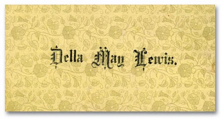
Some Victorian calling cards had patterned backgrounds, like the four following ones. I think of the one directly below as being a Gothic pattern, though I think it's actually supposed to be lace.

Mark D. Ruffner   
Mark D. Ruffner   
Mark D. Ruffner   
Mark D. Ruffner   

One of the things that makes these patterned calling cards appealing is that the pattern is repeated on the back side.
 
Mark D. Ruffner   


Mark D. Ruffner   
My favorite Victorian calling card (and a favorite of the entire ephemera collection) is Joshua B. Gayman's hand stenciled card.

Most of these cards are the size of a modern business card. Joshua's is a little smaller, approximately 2¾" x 1½".

The stencil Joshua Gayman used would have been a paper-thin piece of copper — like the one below — and it's easy to imagine that he used it on many items besides calling cards.

mamaisonfrancaise  |  etsy
.

Thursday, 2 January 2014

Celebrating Tony Jannus and Aviation History

Tony Jannus   |   tampabay.com
Yesterday, my friend Sandy and I celebrated the New Year at St. Petersburg's waterfront, where exactly 100 years earlier the commercial airline industry was born.

In 1913, Percival E. Fansler raised money to start the first commercial airline, the St. Petersburg-Tampa Airboat Line. He hired Tom Benoist to supply the plane and the pilot, a dashing young barnstormer named Tony Jannus.

Tony Jannus was already a pilot of note, having flown the plane from which the first parachute jump was made, by Albert Berry.

Abe Pheil and Tony Jannus   |   tampapix.com
On New Year's Day, 1914, Tony Jannus made a 23-minute trip from St. Petersburg to Tampa, carrying the first commercial airline passenger, former St. Petersburg mayor Abe Pheil. Mayor Pheil bid $400 for the honor, at that time a very large sum.

3,000 spectators watched the plane depart from St. Petersburg, and 3,500 spectators greeted it in Tampa.

I've made this map to show you why Tony Jannus' flight was of so much interest to the citizens of St. Petersburg and Tampa. A trip that today takes me 20 minutes or less by car, would in those days be like driving hundreds of miles!

So yesterday was a festive occasion, with a credible stand-in for Tony Jannus (historical actor Michael Norton) and a lot of people in period costume.

photos: Mark D. Ruffner
The real star of the day was a replica of the Benoist, reconstructed at great cost for the occasion by Kermit Weeks, a pilot and owner of the Polk County, Florida aviation attraction, Flight of Fantasy.

photos: Mark D. Ruffner
Kermit Weeks had intended to reenact the flight on the 100th anniversary of Tony Jannus' crossing, but much to his disappointment, some technical difficulties prevented that.

Kermit Weeks   |   photo: Sandy Gonzalez
Still, his meticulous and authentic reconstruction made for an interesting and impressive display.

the Hoffman X-4 mullet skiff   |   photo: Mark D. Ruffner
Later in the morning, this plane retraced the Benoist route; it's been used before in Tony Jannus reenactments.

photo: Mark D. Ruffner
In keeping with the day's theme, Sandy and I left the rainy celebration and had breakfast at The Hangar, a fun dining spot at St. Petersburg's local Albert Whitted Airport.

photo: Mark D. Ruffner
Here's a painting of Tony Jannus at the Tampa International Airport. It depicts the end of Jannus' career, when he went to Russia to train Russian pilots during World War I. He was flying a Curtis H-7 plane with a two-man Russian crew when he crashed into the Black Sea on October, 12, 1916. His body was never recovered.

Today the Tony Jannus Award is given once a year "for outstanding individual achievement in the scheduled commercial aviation industry."
.