Showing posts with label advertising illustrations. Show all posts

Tuesday, 14 January 2014

T. M. Cleland's Elegant Designs

princeton.edu
Thomas Maitland Cleland (1880-1964) was one of the first art directors and a designer skilled in virtually every aspect of publishing — fine art, graphic art, typography, writing, editing and printing. He was exacting and a perfectionist, and expected others to meet his own standards. And while he could frustrate others because of his demanding standards, he was also known for a good sense of humor.

American Type Founders Co.
T. M. Cleland entered The Artist-Artisan Institute of New York at age 15 and rose quickly in the printing world because of his fine sense of ornamentation.

Are you reading this, Gina?   |   American Type Founders Co.
aaknopf.tumbler.com
Alfred A. Knopf was a great admirer of Cleland's work.

American Type Founders Co.
Do you remember the toy chests that my father decorated in my November posting of family photographs, here? He was inspired by the design above, by Cleland.

Cleland designed several typefaces. He's probably best known for Della Robbia, designed in 1903 and still in popular use today. Around the same time (1907-1908), he became the art director of McClure's Magazine and completely redesigned it.

Westvaco Paper Corporation
A hallmark of Cleland's advertising work is incredible attention to detail (which you'll also see in the paintings I share). Below is a detail from this Westvaco printing magazine ad.

click to enlarge
I find it interesting that Cleland imbued such tiny characters with personality, from the little boy on the left turning to talk to his mother, to the man on the right who appears to be hiding behind a tree!

saturdayeveningpost.com  
Cleland created ads for many prestigious companies, including Cadillac. Here he appears to have painted Monte Carlo in the background.

www.flckr.com/people/americanvintagehome/
This 1928 Cadillac ad is a masterpiece of composition, with the stairs and shadows all pointing to the car. Look at all the flat neutral planes, and then the reflectiveness of the car.

Westvaco Paper Corporation 
I like this Cadillac ad by Cleland for the wonderful Art Deco treatment of the trees. There's an expression in advertising that sometimes you sell the steak and sometimes you sell the sizzle. Here, the emphasis is not so much on the car as it is on an easy lifestyle.

click to enlarge   |   frankzumbach.wordpress.com
This image shows what a master of watercolor Cleland was — I believe it's entitled Romance.

click to enlarge   |   veatchs.com

click to enlarge   |   Westvaco Paper Corporation
Cleland seems to have excelled in painting panoramic views; above is a detail of a larger painting.

peterharrington.co.uk/blog/fortune/
As its first art director, Cleland designed Fortune magazine, and illustrated its first cover. (Note that at the height of the Depression, Fortune cost one dollar!) Cleland also did a typographic redesign for Newsweek.

click to enlarge   |   princeton.edu
This delightful map shows Cleland's sense of humor, and I especially enjoy the wording of the map's cartouche.

georgemacyimagery.files.wordpress.com  
This 1961 title page indicates that Cleland was in demand into his 80s, and I find it interesting that it harkens all the way back to his early printing ornament designs.

Thomas Maitland Cleland died in 1964, and in 1978 was elected to the Art Directors Club Hall of Fame.

linotype.com
.

Sunday, 15 December 2013

A Christmas Tribute To Thomas Nast

In my last posting I mentioned how I developed a technique of drawing with felt-tip markers, creating "nubby" lines that have an antique look. As part of the same campaign, John Atkinson and I promoted the shopping center with a Santa Claus modeled after Thomas Nast's famous image. In my illustration, Santa is holding products that could be found at the shopping center.

click to enlarge   |   © Mark D. Ruffner, 1983
Here is my illustration, and below is the 1862 original. I didn't want to lose that distinctive 18th-century clay pipe!

billcasselman.com
While Thomas Nast (1840-1902) defined the American perception of Santa Claus for decades, he is better remembered as the finest 19th-century American political cartoonist. He is the man who came up with the iconic elephant to represent the Republican party, and while he didn't create the donkey as a Democratic emblem, he popularized it.

click to enlarge   |   artintheage.com
Nast began newspaper work while still a teenager, and worked for both Frank Leslie's Illustrated and Harper's Weekly. He used photographs as reference for his stinging caricatures, and was instrumental in bringing down the powerful New York politician, Boss Tweed. When Boss Tweed fled the country on corruption charges and was apprehended in Spain, it was a Thomas Nast cartoon that identified him. Nast's cartoons are also credited with helping Grover Cleveland become the first Democratic President (in 1884) since the 1856 election.

In 1902, President Theodore Roosevelt rewarded the ailing Thomas Nast by appointing him as Consul General to Ecuador. There Nast contracted Yellow Fever while helping others to escape a similar fate, and died the same year.

.

Thursday, 12 December 2013

Nostalgia, Bleeding and Cutting

When I worked as a commercial illustrator, I was not known by any one particular style, and so I developed a range of styles, and that kept me busy.

click to enlarge   |   © Mark D. Ruffner, 1983
This was a full-page newspaper ad I illustrated one Christmas for a local shopping center. For the line art I developed a technique of drawing on thick, absorbent paper with a felt-tip marker. The felt-tip marker would bleed, but slowly so, allowing me to control the line's "nubbiness." Note how I put my initials on the rocking horse's rear, where a brand would be!

The art director for this job was my good friend John Atkinson, with whom I worked on many fun projects — he came up with the concept (and I've mentioned him before, here). Together we spent one evening cutting amberlith overlays for each color.

George Rorick On Using Amberlith   |   www.channels.com/episodes/15488588
This job was done before the days of the computer, so each individual color would be indicated on an amberlith overlay.

Amberlith is a sheet of acetate that is covered with an orange gel that is both semi-transparent and peelable. The amberlith is placed over the artwork, and the areas for one particular color are cut with an exacto blade so that the amberlith covers those areas, and all the rest is peeled away. The step is repeated for each color, and then registration marks are put on each acetate so that all the colors register at printing time.

Producing full-color ads this way was a tedious job, and I sometimes created ads that had more than 20 color overlays! The Christmas ad above required only five.

While this process is now very much outdated in the digital world, it was the norm in newspaper work well into the 1990s.
.

Wednesday, 20 November 2013

Designing a Conestoga Wagon

click to enlarge   |   Illustration by Mark D. Ruffner, 1973
My blogging friend Gina of Gina Ceramics recently posted a riveting story about a pioneer family and the scary maneuvering of their Conestoga Wagon. You can read about it here. The story reminded me that I had done an illustration of a Conestoga for the Scott Paper Company, back in the 1970s.

I stained balsa wood blue and inset it into an illustration board, then drew around the sunken "implant" with colored pencils. Today, of course, I'd do it in half the time digitally.

Conestoga Wagons were made by the Pennsylvania Dutch in Lancaster County, Pennsylvania. Because the Pennsylvania Dutch cartwrights traditionally painted their wagons blue, and the Pennsylvania Dutch wheelwrights traditionally painted their wheels red, the Conestoga wagon is almost always seen in this color combination.

Illustration by Robert Layport, 1973
The toolboxes that hung on the side of the wagon had wrought iron hinges, and the hinge designs, also coming from Lancaster County, are evocative of German metalwork.

Illustration by Paul Rendel or John Banks, 1973
Quoting from the Scott Paper sample: "Shoeing a wheel in a hot cloud of sweat, steam and smoke. Iron rims were cut a full ¾ inch smaller than the circumference of the wheel. They were heated red hot, sledged into place, then doused with water. The iron contracted violently, tightened all the wooden joints, and further emphasized the "dish" in the wheel."

click to enlarge

click to enlarge   |   Scott Paper Company
The Conestoga Wagon was used in the early 1700s when colonial settlements were established in the Appalachians, and into the late 1800s, as pioneers moved all the way to the West Coast.
.

Monday, 30 September 2013

A Sweet Treat For You

Mark D. Ruffner, 1984
I was sorting through my flat file recently and came upon an illustration I did for a Florida magazine almost 30 years ago. The idea was that if one subscribed to Florida Trend, the new subscriber would be rewarded with a baker's dozen of fresh donuts.

Mark D. Ruffner, 1984
The mailer was designed to arrive looking like a closed baker's box, sealed with an adhesive tab. When one lifted the cover . . .

click to enlarge   |   Mark D. Ruffner, 1984
. . . there would be a dozen juicy, glazed donuts! I achieved the illustration with a mixture of acrylics, airbrushed dyes, pencil and charcoal.

illustration by Paul Davis
I looked to the great illustrator Paul Davis for style. Paul Davis continues to be a source of inspiration, and you can read my posting about him and his iconic work here.

Mark D. Ruffner, 1984
Also inside the mailer was a die-cut 13th donut, redeemable at our local supermarket.

There have been some professional hazards connected with being a commercial artist, and one of them was that in order to complete this particular assignment, I went through two dozen glazed donuts!

Have a great week, and don't overdo.
.

Sunday, 17 March 2013

How Pencil Drawing Saved My Eyesight

Mark D. Ruffner © 2013
As my profile mentions, I started my career as an illustrator. At that time, computers were not the ubiquitous tools that they are today, and businesses didn't have the ability to simply download clip art as they do now. So for a while I made a living selling art to advertising agencies.

Mark D. Ruffner © 2013
I didn't have a distinctive style, but instead emulated whatever style an advertiser wanted to achieve, and became better known as someone detail-oriented. One of my more popular styles was to draw with a pencil in a way that almost looked like air-brushing. (The drawing above was for a sound company that works with broadcast media.)

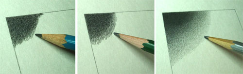
I achieved fine gradations by starting with the darkest areas, using very soft pencils, usually a 5B or 3B pencil. I would then work over the same area — and progressively lighter areas of the composition — with progressively harder pencil leads. The middle pencil above might be an HB or 2H pencil and the pencil on the right might be a very hard lead, like a 6H pencil.

If you look at the first pencil photo, you'll see that there are unevenness's and flecks of darker color. The progressively harder pencils not only add lead to the paper surface, but they also serve to smooth out the softer lead. By the third layer of lead (on the right), the gradation is becoming smooth.

Now here's the interesting part. In order to see the gradation better, I would unfocus my eyes. I found that if I blurred my vision, I could actually see pockets of unevenness better! So as I was creating very detailed pencil drawings, I was essentially alternating between sharpening my focus and resting my eyes in a meditative way. In hindsight, I was giving my eyes healthy exercise the whole while.

In fact I didn't wear glasses until I started sitting in front of a computer.

Mark D. Ruffner © 2013
 I wish I had a dime for every time I've drawn a dollar!

Mark D. Ruffner © 2013
This illustration accompanied an ad that listed the many amenities of the Tampa Hilton, a lot of fun to do.

click to enlarge   |  Mark D. Ruffner © 2013
Here's an illustration drawn for an affiliate of CBS. It features Buck Rogers, Elvis Presley, pitcher Sandy Koufax, the assassination of Lee Harvey Oswald, Flower Power, Orson Welles recording "The War of the Worlds," the moon landing, Jimmy Dorsey and Little Orphan Annie.

I hope you enjoyed my illustrations!
.