Saturday, 18 September 2010

Venetian High Rise in Florida


Architect Design™'s gorgeous September 1 posting on the OAS building, and his equally exciting September 6 posting on the Pan American building - both in Washington, D.C - inspired me to share the Snell Arcade with you. It was built 18 years after the other two (1928) but has some of the same decorative feel. And yet it is different; I would describe the Snell Arcade as Mediterranean Deco (my own label).
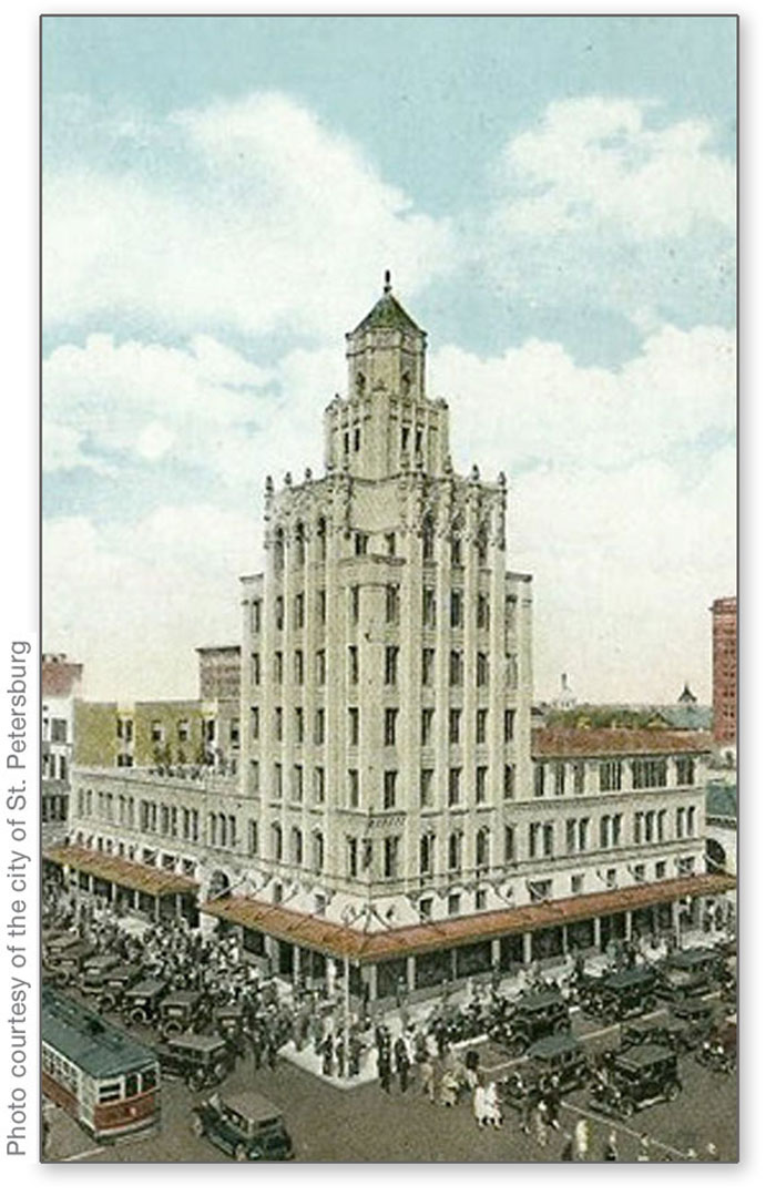
The Snell Arcade is at the main intersection of downtown St. Petersburg, Florida. Officially called the Rutland Building, it is familiar to one and all by the name of Snell. C. Perry Snell was a major developer of St. Petersburg, and it's clear that his own vision was to create on a grand European scale. He favored wide boulevards lined with statuary, and beautiful Mediterranean architecture.


Maybe this should be called Venetian Deco. What do you think?  I've always had a secret desire to completely dismantle the Snell Arcade and reassemble it into my own two-story house. Scale might be a problem, but I'd make it work.


Look at the narrow strips of blue tile between the courses of stone block! Would anyone have the panache to do that today?


The base of the Snell Arcade is made from coral, a practice that has been banned more recently, of course. In my next posting, I'll show you a little treasure inside the Snell Arcade.

Thursday, 16 September 2010

Mandala Meditations

This past Monday I conducted a mandala workshop for the Regional Expressive Arts Practitioners (REAP). I think it went well and that everyone had fun. Thanks to Kathy Luethje for organizing the evening, and thanks to everyone who attended!


I believe, as Carl Jung did, that the mandala is a healing tool, and that to create a mandala is a form of healing meditation. So when I create mandalas, I'm conscious of centering and going inward. My mandalas tend to incorporate the color spectrum associated with the body's chakras, or energy points. Therefore the outer rings will be red, denoting centering of the physical body, and move inward through the spectrum to violet, giving energy to the cerebrum. In the case of the mandala above, painted in acrylics, my theme is gold, so the center focal point is also gold. (The design of white dots is actually the atomic symbol for gold.)


I prefer to make mandalas loosely and with magic markers, like the one above. At this stage, I'm not concerned with making everything perfectly symmetrical. Instead, I'm in a creative zone and working fast. With the mandalas drawn by hand, the process is my focus, not the finished product. Such mandalas can be refined later (because I believe looking at a beautiful, pristine mandala is a meditation in itself), but the designs at this loose stage often have more energy and power.


I also create mandalas on the computer, usually after having worked out the design in pencil, or with magic markers. My computer mandalas can often be other-worldly.


Here are nine mandalas that serve as corporate logos. Left to right and top to bottom: Pilkington Glass, Mercedes-Benz, Target, Accelrys, Google Browser, Yamaha, CBS, Tupperware and Korean Air.

Monday, 13 September 2010

Guilloche and Fabergé


In my last post, I showed a sample of Asher B. Durand's banknote engraving. In the top middle of that specimen sheet, you'll see a rosette. It's an example of guilloche, which is the wonderful pattern of parallel intertwined lines that we all associate with currency security.


This is a detail of a Swiss banknote from the 1970s. Isn't it wonderful? Designers of European currency positively exult in guilloche.


Now, here's a different kind of guilloche. The term also applies to the engraving of the pattern on metal, usually then enameled in the style of Peter Carl Fabergé. In fact, the word comes from Guillot, the engineer who invented the guilloche engraving machine.


When his wealthy patrons would commission an enameled piece from Fabergé, he would show them this chart of guilloche chips, to help them make decisions. Imagine the delight of such choices! This is an illustration from The Art of Carl Fabergé, by A. Kenneth Snowman. While writing his excellent book sixty years ago, Snowman corresponded with and interviewed Fabergé's sons, and also surviving Fabergé craftsmen.


This is a pillbox from my own collection. I bought it while I was in high school, and shortly after reading Snowman's book. When I saw this in an antique shop, I realized that it was a fine design and probably as close as I'd get to owning a Fabergé creation. I based that not just on the flawless enameling, but also because the lid is seamless. If you study Fabergé's work, you'll find that he excelled at hiding hinges and clasps. Many of his eggs opened with the press of a jeweled button. Here, I've placed the pillbox on top of a portrait of Fabergé, though in fact the box is English silver.


And finally, for my architect friends, guilloche also refers to this particular design of intertwined ribbons, which is often found in Greek and Roman architectural detailing.

Friday, 10 September 2010

Asher Brown Durand


Asher Brown Durand (1796-1886) is remembered today primarily for his beautiful paintings of nature. He painted richly detailed views of the Catskills and Adirondacks, and New Hampshire's White Mountains. Durand's work exemplifies the Hudson River School of art.


This painting. Kindred Spirits, is Durand's most famous work. According to Wikipedia, it's valued today at over $30,000,000. It's a tribute to Durand's friend, the painter Thomas Cole, seen talking with the poet William Cullen Bryant.


Not many people who admire Kindred Spirits know that painting was Asher B. Durand's second occupation. Durand, the son of a silversmith, started out as a banknote engraver. It is Durand's distinctive style that has defined the look of United States currency from his time right up to the present. The image above, from the Metropolitan Museum of Art. is one of Durand's sample engravings.


I've always had a soft spot in my heart for Asher B. Durand, the engraver. That's because, as Milton Glaser would say, banknote engraving is part of my "visual vocabulary." As a commercial artist, I've drawn money so many times, it's a wonder I didn't just join the Bureau of Printing and Engraving! I created the pen and ink drawing above for Elcotel, a company that manufactures pay phones.

Wednesday, 8 September 2010

George Washington's Left Eye


 I recently finished a painting that includes a portrait of George Washington.


In order to achieve his likeness convincingly, I assembled three portraits by Gilbert Stuart, and studied and compared them. What I found interesting is how different they appear, and yet how similarly they were painted.

These three portraits by Stuart are each recognizable as George Washington, and yet they feel distinctly different. It’s as though they each reveal a subtly different personality trait in Washington, or at least a different mood.

In studying these images, one has to appreciate that Stuart made his living by painting portraits, and that while Washington's portrait was in high demand, the president had posed only twice for Stuart. Therefore Stuart was busily making copies of his own copies. There was no Washington sitting in front of him and of course, nothing like photographic reference. His own work was the primary reference.


Now compare these eyes from the three portraits. They’re all Washington’s left eye, the right eye as we face the portrait. One can see, especially in the first two eyes, that Stuart was trying to duplicate the likeness, stroke by stroke.


In this image, I’ve superimposed all three faces. While the noses are slightly off-register, the eyes align perfectly. I conclude that Gilbert Stuart used some method of tracing his copies, and I think that the varying moods of Washington’s portraits were never a primary intention. Instead, I think Stuart was focused on simply trying to duplicate, for the umpteenth time, an accurate likeness.

Sunday, 5 September 2010

Hermann Zapf


Herman Zapf (1918-2005) ranks as one of the great typographers of the 20th century. It's a good bet that the computer at which you're now sitting came already loaded with the fonts above, just a few of his many designs.


Zapf designed Melior in 1952. He was intrigued with the shape of the 50's television screen and based the Melior "O" on that form. It's interesting to note that type designers often start their work with the "o," which then becomes the template for many lower case letters.


Most Americans want to pronounce "Zapf" like "half," but the name rhymes more closely with "cough." I had the honor of taking a class with Zapf when I was in college in Pittsburgh, and my lasting impression of him was that he was an exceptionally elegant man. He wore crisp white shirts with French cuffs, and his cuff links were made from gold Roman coins. 


Some time ago I designed a logo for the Konglomerati Foundation, a literary center that was dedicated in part to the preservation of letterpress printing. I asked myself, "What would Hermann Zapf do?" (WWHZD), and this is what I came up with. The logo's shape is the interior of the Melior "O."

Thursday, 2 September 2010

Ephemera - Huyler's Cocoa

In my last post I mentioned chocolate and cocoa beans, so I'll stay on that subject to make a nice segue into the world of ephemera. I collect ephemera, which Wikipedia defines as, "... transitory written and printed material not intended to be retained or preserved. The word derives from the Greek, meaning things lasting no more than a day." Good examples of ephemera might include concert tickets, cigar bands and menus. The ephemera that I collect is primarily advertising from the late 19th century.

This is a paper die cut of a tin can. It's also known as a trade card. Trade cards were usually distributed by merchandisers at the point of purchase, and they were popular from the 1870s through the mid-1890s. They were little premiums that served both as advertising and as the fodder for Victorian scrapbooks. Because they were lithographed (as opposed to being printed in the modern 4-color process), trade cards were exceptionally bright and colorful. That's because, for example, an orange detail would be an printed with pure orange ink, rather than halftone screens of yellow and red.


I also collect antique tins (now to a lesser extent than I used to), so it was a real thrill to find this Huyler's can and to reunite it with its paper relative. Both the paper die cut and the tin were lithographed.