
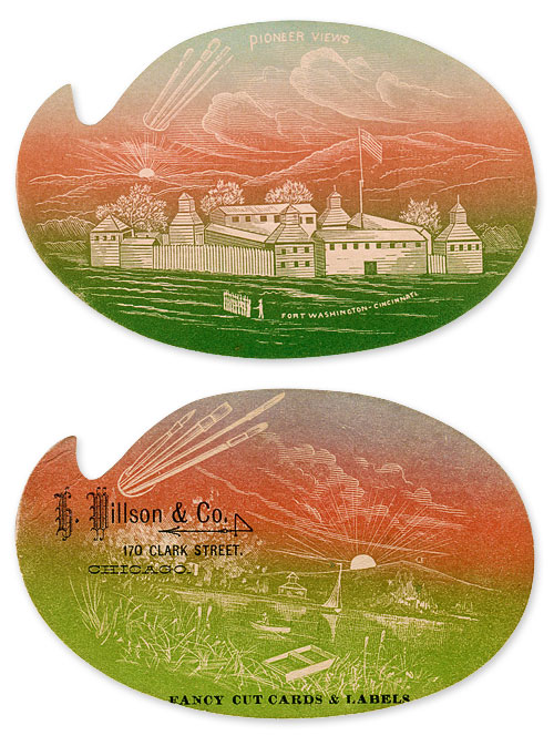
One of my great pleasures in collecting antique advertising is to find duplicates within lesser known genres. Today I'm sharing examples of a subset of trade cards known as "washes." These all would have been printed between approximately 1870 and 1890.


That's because printers created the color spectrum by hand, as shown above, and those three colors would blend into a particularly pleasing spectrum. Most trade cards from the same period were colored through the registration of many lithographed stone plates, so the wash method of colorization was a quick and inexpensive way to achieve "full color."


This distinctive card reads:
CENTENNIAL SALOON
AUGUST MAYER, Propietor,
For Pure Whiskies and Wines for Medical
Use Call on Him at
20 Main St. : : : CRAWFORDSVILLE


The Monarch Livermore Pen, on sale for $3.50, would have been pretty pricey. According to immigrationwatchcanada.org, a skilled laborer of the 1880s would have earned $2.00-$2.50 for a day's work.
.
No comments:
Post a Comment