Saturday, 24 September 2011

A Collection of Early Belgian Advertising


About 25 years ago, I purchased a group of Belgian advertising cards that date to the 1840s. They're all printed from engraved metal plates that were beautifully inked by hand. As one who has experimented with etching plates, I can tell you that the inking of these cards was done by a real master. These colors were all applied to one plate by essentially rubbing the colors into etched grooves. The surface of the plate was then wiped clean, without smearing the colors. Inking the type above into three distinct colors was therefore extremely exacting work.

The originals of all the cards are a little creamier than the scans, but all of the cards are in remarkably clean condition. Each card is approximately the size of an index card, or 3" x 5". I'm including an angled photograph of one of the cards to show that the inks have a rich metallic sheen. Where you see a rusty red on the scan, you see a lovely coppery red on the original.


The cards have lasted for about 170 years in part because they were printed on a very high-quality, stiff paper that was baked with a clay surface. That in turn produced the glossy finish you see above.

Click on any card to enlarge it.


This detail from the last card would date it no earlier than 1841, though several of the cards look as though they could easily be from the 1700s.
.

Tuesday, 20 September 2011

The Wealth of Thomas Jefferson's Library

Photograph by Langdon Clay  |  Jefferson's Monticello, William Howard Adams, 1983

There is a great difference between being schooled and being educated, and while Thomas Jefferson was not the best schooled American of his day, he was very likely the best educated. His pursuit of knowledge was relentless, and along the way, he amassed the country's largest book collection.

The average American family of Jefferson's day likely owned only one book, the Bible. A person of success might own three or four or five, and don't forget that two generations after Jefferson, Abraham Lincoln was walking miles to borrow just one book. Thomas Jefferson owned thousands.

One way to gauge the extent of Jefferson's library is by the number of books that he sold to the Library of Congress. When much of the library was destroyed by fire during the War of 1812, Jefferson offered to sell his entire collection to make up the difference. Jefferson's mounting debts made such a sale mutually beneficial.


Below is the number of books with which Jefferson parted.


The 6,487 books that Jefferson sold to the Library of Congress
With the sale of those 6,487 books (for $23,950), Jefferson still retained a couple thousand! He kept them under lock and key in his private quarters — a suite of bedroom, study and library. Truly honored guests at Monticello were invited into the inner sanctum for a private tour.

At his death, Jefferson was again hugely in debt, and his family was required to sell what remained of the library, as well as Monticello itself.

In 1851, a second fire at the Library of Congress destroyed approximately two-thirds of Jefferson's books. Today, with a generous grant from Jerry and Gene Jones, the Library of Congress is in the process of rebuilding Jefferson's collection as it was originally sold.

.

Friday, 16 September 2011

Before the Spirograph

© Mark D. Ruffner, 2011

I was noticing that my readers seem to enjoy looking at my posting on guilloche, and that got me thinking about our fascination with spirals, and a favorite American toy — the Spirograph!

designobserver.com and vintagetoysillustrated.com

If you were of a certain age in 1967, the biggest Christmas present of the year was Kenner's Spirograph. By fitting together a variety of plastic pieces, one could make an endless combination of guilloche patterns, or spirals. Kenner also sold a deluxe model, with many more pieces and the possibility of even more fun creations.

I missed out on the Spirograph because I was well beyond the age of those kids on the box cover; actually I was already away from home.

But in the 1950s, I played with the precursor of the Spirograph — the Magic Designer!

I still have it, box and all.


No plastic here — this was a designing machine! All the parts were metal, and the Magic Designer had the look of an engineering instrument. It came with its own neato paper die cuts for drawing. I still have a supply of those, too.


Below is information on the disc envelope for reordering. Note that the 6¢ postage would have been extra, for special handling!


The Magic Designer was a hugely popular Christmas present in its own time, and I should know. The Christmas morning I received mine, I didn't get much time to play with it because my father and grandfather were having all the fun!

Today I enjoy creating mandalas, which occasionally appear spiral-like. I created the header of this posting on the computer. It's a better tool for such designs, but I wouldn't be surprised if the ultimate Spirograph is yet to come.
.

Monday, 12 September 2011

The Imagination Series


One of my prized collections is a stack of paper samples, called the Imagination Series. My collection is fascinating to read, exciting to look at, and represents one of the great turnarounds in merchandising history.

In the early 1960s, Champion Paper was a company that was virtually unknown to designers and art directors. It was a time when most paper companies hawked their samples as dull little composition books of blank, multicolored pages. Looking at paper samples was like looking at blocks of really subtle sticky-notes.

James Miho   |   aiga.com

That all changed after a survey confirmed that the company had no name recognition. From 1963 to 1986, largely under the direction of James Miho, Champion Paper produced a yearly sample book, each themed and extravagantly illustrated. There were 26 books in all (there were multiple editions several years), and their themes included San Francisco, U.S. rivers, Brazil, Australia, Hong Kong, the circus, catalogues, Main Street, time and trees — to name a few.


The sample books, which were often a full year in the making, were doubly special. On one hand, they contained hundreds of interesting facts pertaining to their particular theme. Here, for example, is a spread in Volume 16 — which was devoted to Brazil — on tiles:


But what was also special about the Imagination Series is that each page was a different type of paper, and almost every image was printed in a different way. Volume 18 — which was devoted to Hong Kong — featured a transportation page showing the different possibilities of black inks, including when used with silver ink:


In Volume 12 — which was devoted to San Francisco — there's a page featuring famous personalities associated with the city. Each portrait also represents a very different inking formula (which is true for images throughout each edition). I've selected three images that show how differently red ink (magenta) can be used.

The Imagination Series was aptly named because it showcased all sorts of imaginative printing possibilities and surprises — additional brochures, multi-layered die cuts, metallic and varnished inks, and pockets revealing folded maps and charts. The series became an immensely valuable printing resource for designers.


Of course such samples were very expensive to produce, so when the Champion Paper salesperson came to the ad agency, he could only spare editions for selective designers (the people who would actually order paper). Other employees would beg, borrow and steal (quite literally!) to get the the latest of the Imagination Series. Few people were as welcome in an ad agency as the Champion Paper salesperson, and the Champion Paper Company quickly became a leader in the advertising and printing industries. It also caused other paper companies to become more design-conscious in their own merchandising.


I still look through these splendid books for inspiration.
.
Thursday, 8 September 2011

Illustrator Richard Hess


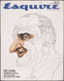
Richard Hess (1934-1991) started his career as a teenager, designing paint-by-number kits for the Palmer Paint Company of Detroit. Years later he must have enjoyed the irony of creating an Esquire magazine cover with a Lyndon Johnson paint-by-number portrait.


Hess always wanted to be a painter, but after his early days at the Palmer Paint Company, he found success instead as designer in the advertising world. After stints in advertising agencies in Detroit, Philadelphia and New York, Hess formed his own company and had a very successful career as an art director. His clients included IBM, Du Pont, Xerox, PanAm, AT&T and many more.


His work for Vista magazine was typical of his expansive talent — he would redesign the logo (which could be read correctly upside down) redesign the magazine format, and then paint the cover illustration. Above are Hess' logos for Vista, Franklin Typographers (with a positive and negative "F") and Perfect Film & Chemical Corporation.

As an art director, Richard Hess would assign work to the great illustrators of the 1970s, including Milton Glaser, but in a pinch he'd do an illustration, always with great success. Below is a drawing of Winston Churchill that Hess did at the last moment, when an illustrator missed an assignment deadline.


Starting in 1971, Hess began doing illustrations on a regular basis. He continued to art direct as well, essentially juggling two separate careers. He even named his company Hess & Hess. (Since this original posting, illustrator Mark Hess has verified that Hess & Hess referred to the collaborative work between him and his father.)

Franklin Typographers poster   |   1972

Franklin Typographers poster   |   1975

Illustration for Vista magazine  |  1975

Cover for Graphis magazine  |  1977

Book jacket illustration for Joe Lewis: My Life  |  1978

Illustration for "Poor Concentration/Poor Memory"  |  1978

Illustration for Xerox employee brochure  | 1970s

And I'll end with one of my favorite Hess paintings, his record cover illustration celebrating Charles Ive's 1974 centennial, for Columbia Records.

Click to enlarge

Richard Hess collaborated throughout the 1980s on illustrations with his son Mark Hess, whose style is very compatible. Mark Hess is equally talented, has illustrated numerous covers for Time magazine, and his work can be seen here.

Richard Hess died in August of 1991 at the age of 57. That same year, he was inducted into the Art Directors Club Hall of Fame.

.

Monday, 5 September 2011

You Are What You Are


As I was growing up, the arrival of Time magazine was always one of my weekly high points. Because news reporting was not as instantaneous then as it is today, Time would feature an in-depth news trend, and that would almost always be reflected in a beautifully executed cover design. As a teenager, I started collecting Time covers, in large part because of the striking portraits of Boris Artzybasheff.

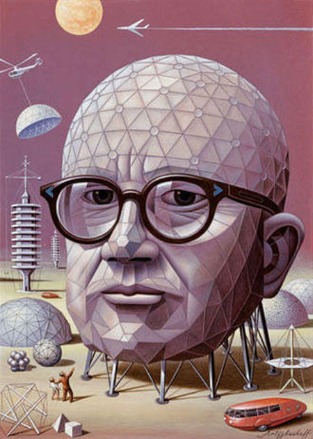
Artzybasheff was famous for illustrating anthropomorphic machines, and conversely, he would sometimes paint portraits of people as the object for which they were known. Artzybasheff's portrait of Buckminster Fuller as a geodesic dome is probably the most famous example.

Today I thought you might enjoy a collection of anthropomorphic portraits by a variety of artists. I call this posting, "You Are What You Are." Most of these will enlarge if you click on them.


Dave Stevenson depicted Frank Lloyd Wright as an architectural blueprint, for a Simpson Paper Company promotional brochure. Stevenson actually had a blueprint made of a black and white ink drawing.


Illustrator John Craig created this collage of Henry Ford for the same 1986 Simpson Paper Company brochure.


My favorite in the Simpson Paper Company series is this portrait of Charles Francis Richter, creator of the Richter Magnitude Scale. It's also by Dave Stevenson. Be sure to click on this and see it enlarged!


This architectural portrait of Le Corbusier is by Louis Hellman, a very witty architectural cartoonist. You can see his mausoleum to a baroness here.


This astonishing self-portrait of Scott Marr is in the form of the Australian natural elements that Scott draws, in part by burning into wood. It's an art form known as "pyrography." You can see more of Scott Marr's exceptional work by visiting my blogging friend Theresa Cheek's great posting about him, here.


This is a self-portrait patchwork quilt by quilter Mary Elmusa. It measures 30" x 30" and is made of dyed cotton fabric, stitched with metallic thread. This image and other great quilts can be found at kansasartquilters.org.


Milton Glaser of Push Pin Studios made this delightful portrait of Alexander Hamilton as a collage of banknotes and financial documents. It dates to the mid 1960s.


Charles Tsevis created this portrait of Steve Jobs using Apple products. It dates to 2008 and was found at iTech News Net, Latest Gadget News and Reviews.


This portrait doesn't fit into my theme exactly, but no posting of anthropomorphic portraits would be complete without an example by Giuseppe Arcimboldo. Were it to fit properly into my theme, this would be a portrait of a gardener. Actually it's believed to be a portrait of Arcimboldo's patron, Holy Roman Emperor Rudolf II (1552-1612). I personally would have refrained from depicting my patron as a stack of vegetables, but the portrait was presented to Rudolf II as Vertumnus, God of the Seasons. Rudolf II loved it, and commissioned a similar painting for each season.
.